Bila UiTM Cuti
Bila UiTM Cuti academic calendar and Find My Internship — what ships on bilauitmcuti.com and the design system both features share.
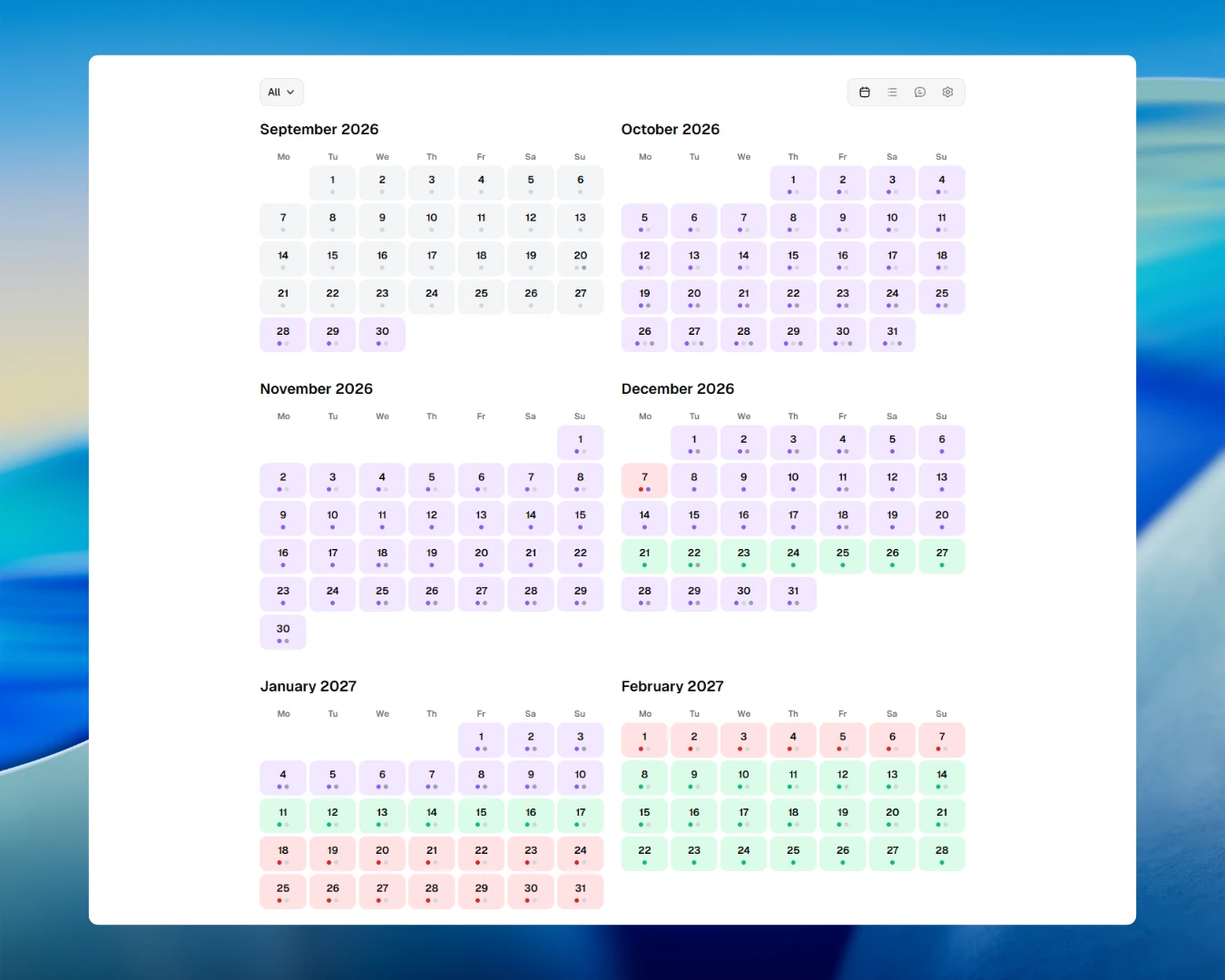
Every semester, UiTM students ask bila cuti? Bila UiTM Cuti is a student-focused web app for academic calendar timelines plus Find My Internship on the same domain.
The Problem
| Area | Pain point |
|---|---|
| Academic calendar | PDFs and portal pages — not mobile-friendly, not searchable |
| Group A / Group B | Wrong group checked → wrong cuti date |
| Schedule coverage | No single view for registration, lectures, exams, and breaks |
| Internships | Listings spread across job portals and company career pages |
| Search cost | Hours lost each application season opening separate sites |
The Solution
| Feature | URL | Role |
|---|---|---|
| Academic calendar | bilauitmcuti.com | Registration, lectures, exams, and breaks in one app |
| Find My Internship | bilauitmcuti.com/internship | Browse internship listings on the same domain |
| Design system | Both surfaces | Shared tokens, type, and components |
Academic calendar
Built for phones, tablets, and desktop — same experience across grid and list views.
.webp)
| Capability | Detail |
|---|---|
| Views | Grid and list with activity filters |
| Sessions | Group A and Group B |
| Regions | Kedah, Kelantan, and Terengganu date filters |
| Countdown | Next activity |
| Theme | Light and dark |
| Install | PWA |
| AI chat | Google Gemma 4, Llama 4 Scout, Mistral Small 3.1, Nemotron 3 Super on Cloudflare Workers AI — English and Malay |
| Calendar monitoring | Firecrawl — watches the official UiTM academic calendar site for changes |
| Program | Supported |
|---|---|
| Foundation / Professional | Yes |
| Pre-Diploma | Yes |
| Diploma | Yes |
| Diploma (Part-Time) | Yes |
| Bachelor | Yes |
| Bachelor (Part-Time) | Yes |
| Master | Yes |
| PhD | Yes |
| AI assistant | Detail |
|---|---|
| Host | Cloudflare Workers AI |
| Models | Google Gemma 4, Llama 4 Scout, Mistral Small 3.1, Nemotron 3 Super |
| Languages | English, Malay |
| Context | Selected program and schedule |
| Limitation | Answers may be incomplete or outdated — verify with official UiTM sources |
Find My Internship
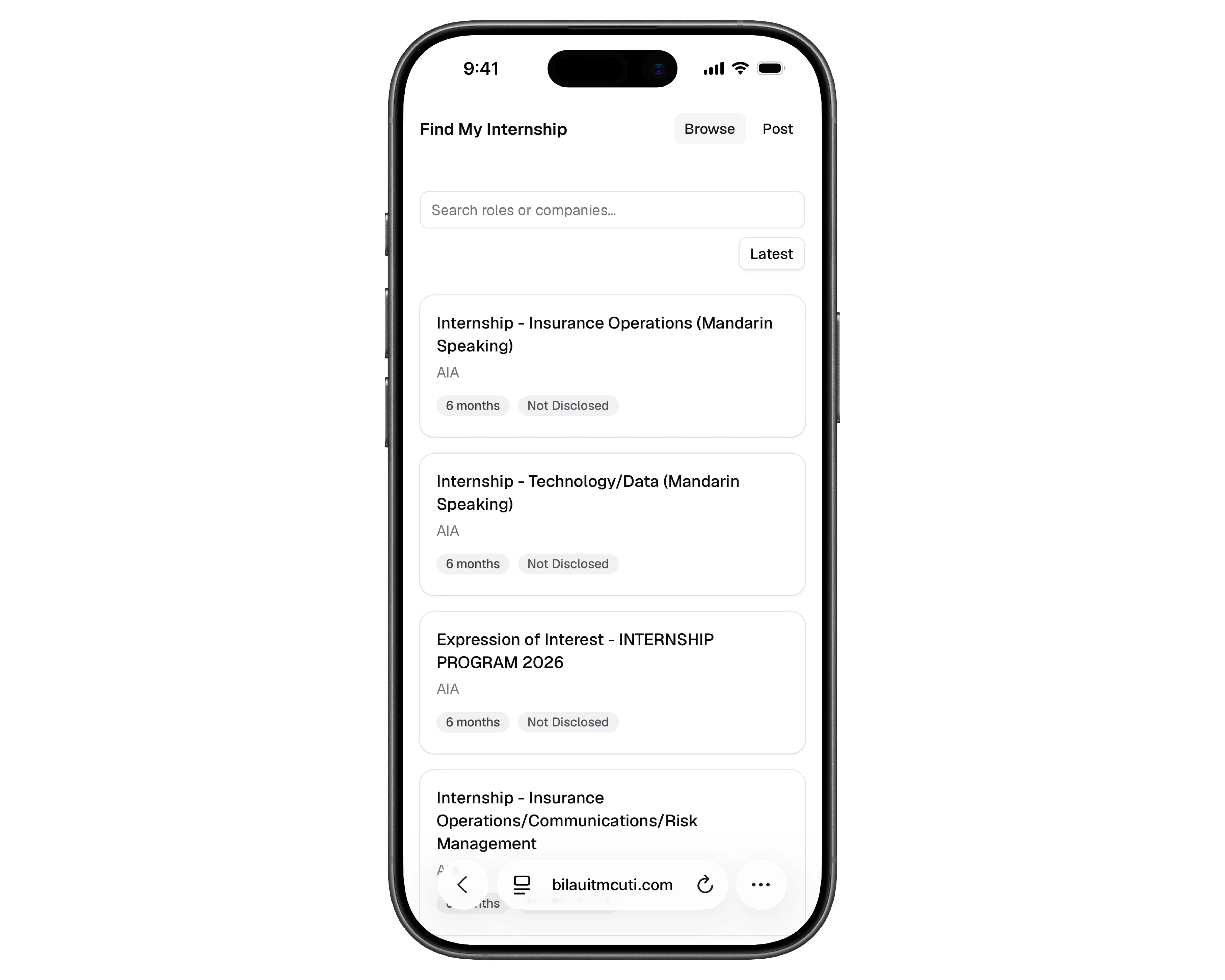
| URL | bilauitmcuti.com/internship |
| Same domain as calendar | No separate site or student account |
| Sources | Job portals and company career pages |
| Scraping | Firecrawl — keeps listings fresh across sources |
| Per listing | Role, company, duration, stipend range, source |
| Browse | Load more in one place instead of many tabs |
One design system for both features
| Surface | Shared treatment |
|---|---|
| Calendar | Semantic tokens, typography, components, dark mode |
| Find My Internship | Same shell — no visual jump between grid and listings |
| Goal | One product feel on bilauitmcuti.com and /internship |
The sections below document tokens and components used in production.
Stack
Production stack for bilauitmcuti.com:
| Layer | Production choice |
|---|---|
| Framework | Next.js App Router + React 19 |
| Styling | Tailwind CSS v4 |
| Components | shadcn/ui — Base UI |
| Hosting | Cloudflare Pages + Workers |
| AI models | Google Gemma 4, Llama 4 Scout, Mistral Small 3.1, Nemotron 3 Super via Cloudflare Workers AI |
| Web monitoring & scraping | Firecrawl — official calendar monitoring + internship listing scrape |
| Internship data | Cloudflare D1 |
| Theming | next-themes (light / dark) |
| Fonts | Geist Sans + Geist Mono |
Framework
Next.js App Router + React 19
Styling
Tailwind CSS v4 (@import 'tailwindcss')
Component primitives
shadcn/ui — Base UI
Base UI
Dialog, Select, Popover, Tooltip, etc.
Icons
Lucide React
Theming
next-themes (class-based light / dark)
Fonts
Geist Sans
Geist Mono
Utilities
cn() — clsx + tailwind-merge
Hosting
Cloudflare Pages + Workers
AI model
Google Gemma 4, Llama 4 Scout, Mistral Small 3.1, Nemotron 3 Super (Cloudflare Workers AI)
Web monitoring & scraping
Firecrawl
Internship storage
Cloudflare D1
Semantic tokens
| Principle | Practice |
|---|---|
| Role over hex | Surfaces declare card, popover, or muted — colour is decided once |
| Theme flip | Components inherit tokens; no per-layout hardcoded colours |
| New tokens | globals.css → @theme inline → Tailwind utilities |
| Layer | Detail |
|---|---|
| 1 | CSS custom properties — :root / .dark |
| 2 | @theme inline — --color-* bridge |
| 3 | Tailwind utilities — bg-background, rounded-lg |
| Token | CSS variable | Utility | Role |
|---|---|---|---|
| Background | --background | bg-background | Page / app shell |
| Foreground | --foreground | text-foreground | Primary text |
| Card | --card | bg-card | Card surfaces |
| Card foreground | --card-foreground | text-card-foreground | Card text |
| Popover | --popover | bg-popover | Popovers, menus, tooltips shell |
| Popover foreground | --popover-foreground | text-popover-foreground | Popover text |
| Primary | --primary | bg-primary | Primary actions |
| Primary foreground | --primary-foreground | text-primary-foreground | Text on primary |
| Secondary | --secondary | bg-secondary | Secondary surfaces, chips |
| Muted | --muted | bg-muted | Subtle backgrounds |
| Muted foreground | --muted-foreground | text-muted-foreground | Helper text |
| Accent | --accent | bg-accent | Hover / focus fills |
| Destructive | --destructive | bg-destructive | Errors, destructive actions |
| Border | --border | border-border | Borders |
| Input | --input | border-input | Form fields |
| Ring | --ring | ring-ring | Focus rings |
| Surface elevated | --surface-elevated | bg-surface-elevated | Elevated dark-mode surfaces |
| Chart 1–5 | --chart-1 … --chart-5 | bg-chart-* | Admin chart series |
Where each format lives
- Token flow: CSS custom properties (:root / .dark) → @theme inline { --color-* } → Tailwind utilities (bg-background, text-muted-foreground).
- Add new tokens in app/globals.css, bridge in @theme inline, then use as Tailwind utilities.
- Domain colours extend lib/calendar-activity-colors.ts or lib/data.ts — never scatter hex in components.
- Activity colour map is shared by grid-view.tsx, calendar-header.tsx, and the legend (previously duplicated).
Token previews follow the site theme. Press D to toggle light/dark.
Background
bg-background
Page / app shell
Foreground
text-foreground
Primary text
Card
bg-card
Card surfaces
Card foreground
text-card-foreground
Card text
Popover
bg-popover
Popovers, menus, tooltips shell
Popover foreground
text-popover-foreground
Popover text
Primary
bg-primary
Primary actions, dark-mode toggle track
Primary foreground
text-primary-foreground
Text on primary
Secondary
bg-secondary
Secondary surfaces, chips
Secondary foreground
text-secondary-foreground
Text on secondary
Muted
bg-muted
Subtle backgrounds
Muted foreground
text-muted-foreground
Secondary / helper text
Accent
bg-accent
Hover / focus fills
Accent foreground
text-accent-foreground
Text on accent
Destructive
bg-destructive, text-destructive
Errors, destructive actions
Border
border-border
Borders
Input
border-input, bg-input/30
Form fields
Ring
ring-ring
Focus rings (ring-3 ring-ring/50)
Surface elevated
bg-surface-elevated
Elevated dark-mode surfaces
Chart 1
bg-chart-1
Admin — page views
Chart 2
bg-chart-2
Admin — unique visitors
Chart 3
bg-chart-3
Internship submissions
Chart 4
bg-chart-4
Bounce rate
Chart 5
bg-chart-5
Reserved / future
Light shell
#ffffff
Dark shell
#1a1a1a
Elevated dark surface
#2A2A2A
Dark mode
| Light | Dark | |
|---|---|---|
| Approach | Deliberate palette | Parallel design — not an inversion |
| Colour space | OKLCH | Perceived lightness stays consistent across modes |
| Flash | Blocked before hydration | No wrong-theme flicker on first paint |
| Shell | Background | Text |
|---|---|---|
| Light | #ffffff | #1a1a1a |
| Dark | #1a1a1a | #ffffff |
| Elevated dark | #2A2A2A | — |
| Note | Detail |
|---|---|
| Modes | Light (default) and dark only — enableSystem: false |
| Storage | localStorage key theme; class on html |
| PWA | theme-color synced to shell pair |
| Transitions | Disabled on theme/colour change — instant switch |
Theme preview follows the site toggle. Switch is instant with no colour fade.
Next break
Mid-semester
12 days left
- Two modes only: light (default) and dark — enableSystem: false.
- Theme stored in localStorage key theme; class toggled on html.
- PWA theme-color follows shell pair (#ffffff light, #1a1a1a dark), synced by theme-toggle.tsx.
- @custom-variant dark (&:is(.dark *)); and standalone (@media (display-mode: standalone)) for PWA header tweaks.
- Transitions disabled globally on theme/color changes — instant switch.
Calendar colour language
| Activity | Accent | Reads as |
|---|---|---|
| Registration | Gray #d1d5db | Neutral, administrative |
| Lecture | Purple #8b5cf6 | Teaching — brand colour |
| Examination | Red #dc2626 | Tense accent |
| Break | Green #10b981 | Positive accent |
| School holiday | Amber #f59e0b | Secondary hierarchy |
| Weekend | Gray-violet #71717a | Lowest priority |
| Program | Light | Dark |
|---|---|---|
| Pre-Diploma | #D97706 | #FBBF24 |
| Diploma | #0891B2 | #22D3EE |
| Part-Time | #65A30D | #A3E635 |
| Bachelor | #DB2777 | #F472B6 |
| Master | #7C3AED | #A78BFA |
| PhD | #BE123C | #FDA4AF |
| All Students | #3f3f46 | #e4e4e7 |
Title accent in the live app
Bila UiTM Cuti
Registration
#d1d5db
Lecture
#8b5cf6
Examination
#dc2626
Break
#10b981
School Holiday
#f59e0b
Weekend
#71717a
Program badges in list view
In the app: bg-[colour]/10 with matching text, plus dark-mode variants per program.
Elevation & radius
| Layer | Token |
|---|---|
| Base surface | background |
| Cards | card |
| Elevated (chat, overlays) | surface-elevated |
| Token | Value | Utility | Usage |
|---|---|---|---|
| Base | 0.625rem (10px) | rounded-lg | Default reference |
| Small | calc(var(--radius) - 4px) | rounded-sm | — |
| Medium | calc(var(--radius) - 2px) | rounded-md | Buttons, inputs |
| Large | var(--radius) | rounded-lg | — |
| XL | calc(var(--radius) + 4px) | rounded-xl | Cards |
| 2XL | calc(var(--radius) * 1.8) | rounded-2xl | — |
| 3XL | calc(var(--radius) * 2.2) | rounded-3xl | — |
| 4XL | calc(var(--radius) * 2.6) | rounded-4xl | Badges |
Base
rounded-lg
Default reference
Small
rounded-sm
Medium
rounded-md
Buttons, inputs
Large
rounded-lg
XL
rounded-xl
Cards
2XL
rounded-2xl
3XL
rounded-3xl
4XL
rounded-4xl
Badges
Motion & typography
| Motion rule | Detail |
|---|---|
| Theme / colour change | Instant — transitions disabled globally |
| Chat header | transform / translate 300ms — deliberate exception |
| Nav hover | Foreground colour on hover, desktop only |
| Control hover | Opacity-only transitions (100ms) |
| Gradient fades | 24px fades using var(--background) on chat/calendar fades |
| Theme switch | No cross-dissolve on colour changes |
| Context | Classes | Sample |
|---|---|---|
| Calendar hero title | text-5xl font-semibold tracking-tight | Semester 1 2025/2026 |
| Card title | font-heading text-base font-medium | Next break |
| Body / UI | text-sm | Forms, chat, controls |
| Muted copy | text-muted-foreground | Days until mid-semester break |
| Tooltips | text-xs | Tap to view full calendar |
| Chat input | text-sm | Ask when the next break is… |
| z-index | Usage |
|---|---|
z-[9] | Chat / calendar top fade |
z-35 | Calendar scroll-restore overlay |
z-40 | Calendar controls sticky |
z-[60] | Fixed calendar controls (mobile) |
z-[9999] | Version banner |
Calendar hero title
Geist Sanstext-5xl font-semibold tracking-tightSemester 1 2025/2026
lib/calendar-title-styles.ts
Card title
Geist Sansfont-heading text-base font-mediumNext break
Body / UI
Geist Sanstext-smForms, chat, and controls — default 14px
Muted copy
Geist Sanstext-muted-foregroundDays until mid-semester break
Tooltips
Geist Sanstext-xsTap to view full calendar
Chat input
Geist Sanstext-smAsk when the next break is…
Below 16px-equivalent can trigger iOS zoom-on-focus
Chat header
transform/translate transition 300ms — the one deliberate motion exception.
Nav hover
Foreground colour on hover, desktop only (@media (hover: hover)).
Control hover
Most controls use opacity-only transitions (100ms).
Gradient fades
24px fades using var(--background) on .chat-input-area::before, .chat-top-fade, .calendar-controls-fade, and .suggestions-fade-left/-right.
Responsive shell
.responsive-shell-bg forces white in light mode, var(--popover) in dark.
Theme switch
Transitions disabled globally on theme/color changes — instant switch, no fade.
Z-index layers
z-[9]Chat / calendar top fadez-35Calendar scroll-restore overlayz-40Calendar controls stickyz-[60]Fixed calendar controls (mobile)z-[9999]Version bannerComponents
| Layer | Source |
|---|---|
| Primitives | shadcn/ui + Base UI — dialogs, tooltips, focus |
| Custom identity | Calendar colours, type scale, elevated surfaces, pill badges |
| Admin charts | Chart series tokens for views, visitors, submissions |
| Button variant | Use |
|---|---|
default | Primary CTA |
outline | Secondary, bordered |
secondary | Soft filled |
ghost | Icon / toolbar |
destructive | Delete / dangerous |
link | Inline text actions |
| Component |
|---|
| alert |
| avatar |
| badge |
| button |
| card |
| chart |
| context-menu |
| dialog |
| drawer |
| dropdown-menu |
| kbd |
| markdown-renderer |
| popover |
| select |
| sonner |
| table |
| tabs |
| textarea |
| tooltip |
Button variants
- default — Primary CTA
- outline — Secondary, bordered
- secondary — Soft filled
- ghost — Icon / toolbar
- destructive — Delete / dangerous
- link — Inline text actions
Badge variants
Focus & invalid states
Shared focus ring: focus-visible:ring-3 ring-ring/50. Invalid fields pick up destructive ring via aria-invalid.

Comment from shadcn, the creator of shadcn/ui and a Design Engineer at Vercel, on a design I shared.
“very convenient to check for the events that happening during the week, easy and fast to access .”
“Good page wish we can personalized it to fit every student”
“Mantap. Well organised, i love the layout, easy to locate and understand”
“i am so thankful for the developer, as someone who studies business tech i see big opportunities and talent right here, thank you for developing the websites it is really convenience and easy to use and it helps me mentally, seeing the calendar helps me to cope lagi-lagi time mentally drained and burnout, like knowing the fact that i hv 2wks left to finish my deg, and my 2mnths break, comforts me”
“Good for all students and also new students to refer but at least if cuti semester making it counting day it could be better so they know on the day the press the button "OUH they still have a days untuk cuti"”
“Good website and very interactive, keep it up!”
“Useful to see specific weeks, pretty good”
“THANK YOUUU FOR MAKING THIS APP”
“Nice and very helpful”
“very nice, me likey”
“Thank you for doing this!!! Genuinely appreciated”
“Best! Senang nak track cuti and beli ticket balik.”
“Good apps for students to refer ourselves to academic calendar”
“syiokk senang nak set timing balik umah instead of bukak calendar kena kira sendiri”
“thank you for creating this app that really helps me navigate my holidays, i live what you're doing here, it's beneficial to many students”
Feedback from UiTM students on the academic calendar app.